What A Facebook Page Should Look Like In 2017
Ivan Ivanov posted on 4 September 2017
The way we use social media has rapidly changed in less than a decade. Much like the rise of the Internet in the 1990s and the early 2000s redefined the idea of a webpage, the past few years have transformed the way we see and use online networking platforms.
With Facebook being the first place many of its users seek information, a Facebook page is now more of a necessity than a promotional tool for your website or blog. In 2017, businesses are made with a Facebook page.
More often than not, you’ll see brands and influencers having the wholesome of their online presence solely on Facebook. And that’s not necessarily a bad thing.
As people use the social network as a gateway towards information, instead of firmly relying on Google, there is a noticeable rise in the natural traffic and reach via posts and Facebook’s native search engine. In addition, with the company constantly adapting to a new generation of thinkers, ads on the platform are now more successful than ever.
But all that also means that the bar for what a Facebook page should look like in 2017 is now higher than ever. Just a few years ago, all you had to do is simply put a profile photo, a cover image and short information for your company and you’d be set. However, today, things are quite different than what they used to be.
Informative Description with the Necessary Details
To run a successful Facebook page in 2017 you have to make sure that you’ve filled out any field the platform offers you. When running a business page, entering closing and opening times, your location and a telephone number are almost a necessity.
By sharing such information on your page, you will be able to let people find you more easily. In addition, you should fill out every field in the appropriate manner. For example, if you want to focus more on inbound marketing, you should provide short and friendly description of your business.
On the opposite end of the spectrum, if your audience is B2B you have to be clear, corporate and concise. In both cases, your description should be unique to your Facebook page.
Make sure to avoid the use of long texts but be detailed enough so that a visitor is able to receive the information they are looking for via a simple glance at your page overview.
Brand Complementing Facebook Profile and Cover Photos
The next item to look out for when adapting your Facebook page for 2017 is the use of proper imagery. Visual stimuli are crucial for any social media strategy and the profile and cover photos of your company page are the foundation.
From 2012 to 2015, with the outbreak of social media management, a brand profile was considered to be upscale and professional when simple, logo-based, abstract imagery was used.
A cover photo with material design-like elements and your business’s logo in the center is still considered by many to be the right call. Yet, this might not be the case. The profile and cover imagery you use should both complement your brand and each other.
Much like with any other media, photos and design trends on social networks are driven by people’s desire for difference. To entice the curiosity of the viewer, you should avoid using outdated social media designs. Instead, opt for rich quality cover photos that implement a creative and abstract elements.
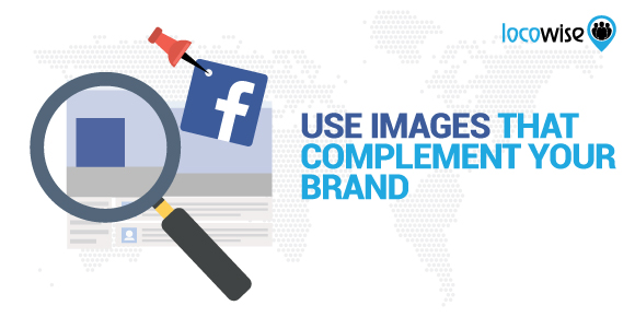
For example, for a restaurant, a simple photo of a dish with a cutout that includes the opening and closing times of the business might be the right call. On that note, make sure to also include relevant information on your cover designs. Instead of text that includes the names of your profiles on social media or your web page, make sure to include details that your audience might find useful.
Facebook doesn’t have an option to tag an image with a link. Thus, on your cover photo you should put text-based information that tells the viewer enough and doesn’t require additional actions, such as a web search or typing.
In addition, including your brand name or logo on your cover photo is not the best option. Consider the fact that your profile photo shares your logo and your page name is enough for a viewer to know.
Optimized for a Mobile-First Experience
At the end of last year, mobile usage surpassed desktop use for the first time in history. While this is primarily due to the emerging digital markets in developing countries, the numbers paint a clear picture.
Depending on your audience, chances are a viewer’s first experience of your Facebook page will be through a mobile app. With that in mind, and if you’d also want to future-proof your social media strategy, make sure to optimize for a mobile-first experience.
On the surface there isn’t much difference between the desktop and mobile version of a Facebook page. In fact, the most noticeable item that separates the two experiences is the design of the page itself.
Nevertheless, mobile use also differs from desktop in terms of content. With that in mind, make sure to test and think of your user’s experience as a mobile-first.
The Facebook Page Call to Action Button is Not Optional in 2017
If you want to have a fully optimized Facebook page, you should use all of the tools that the platform provides you with. This includes the call to action button.
First presented in 2014, the button is a helpful tool that lets you easily persuade your audience and convert your reach and viewership to actionable results. Widely used by apps and games on the platform, the button allows you to program in several options.
You can connect it to an eCommerce for booking and shopping options, place a “Contact Us” toggle, start up an app or game or direct a user towards watching a particular video.
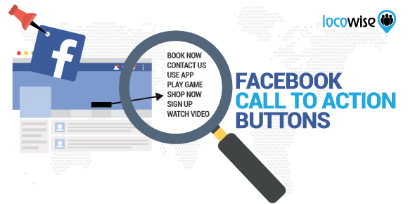
For a brand page in 2017, this button is a necessity. Don’t disregard it as an item of no use, but instead use it to its full potential.
Visual Content is Still King in 2017
Last, but not least, we should also touch on the content. Although Facebook’s post engagement has been rather hectic in 2016, in 2017 the analytics provide a clear picture.
Facebook video is the most engaging type of post with images coming to a close second. In addition, the live broadcasting feature presented by the platform is also proving to be a viable content option. All things considered, you should always put visual content on top of your priority list.
In addition, it should go without question that connecting your Facebook page to other social media networks is simply not a viable option. Content posted on Instagram and Twitter should be unique to those platforms, as should be the content of your page on Facebook. This has been true for the past several years and is still true today.
Another factor that comes into play with natural Facebook reach is the consistency, timing and quantity of your posts. Your post engagement is based on certain percentages that relate to the number of your posts on a page. The result helps the Facebook algorithm decide whether or not to feature given content on the feed of an individual from your audience.
Of course, other factors, such as that person’s engagement with your page itself, do also come into play.
However, taking a note of the number of times you post per day can have a huge impact on your engagement rate. For example, if you have a small audience and post several times per day, if your audience doesn’t engage with all of your posts, the algorithm will slowly but surely lower your reach.
In the same case, if you post once, but all of your audience engages with your post, chances are it will show up on the feeds of the friends of the people that have liked said post.
To play to your strengths and boost your engagement even further, you should also post at the time at which your Facebook page audience is most active. For example, if your audience is in the U.K. you certainly don’t want to share your updates on U.S. time.
Of course, this goes even further than time zones, based on the specific time at which your audience is most active.
Of course, if you don’t want to calculate the time by yourself, you can simply join the 7-day-free trial of Locowise. We provide you with a number of useful features to help you with your social marketing strategy, such as audits, analytics and more. Learn more here!

