How Instagram Photos Paint A Bigger Picture
Ivan Ivanov posted on 20 September 2017
Comparing a social media influencer or brand profile on Instagram with that of a regular Joe there is often a noticeable difference. You see it, you feel it, yet most people just can’t put their finger on it.
The first item that comes to mind usually is the quality. And for the most part, this is true. Businesses and professionals take good care in selecting the right content to post on the photo sharing platform. This is not true for most regular folks.
But the simple difference in camera and photo quality is not the only thing that makes up a professional Instagram account. The crucial detail that comes into play is visual flow consistency.
Why Social Media Managers Are More Talented Than you Think
More often than not, people jokingly disregard social media managers and influencers as people who do nothing more than post photos and make jokes on social networks. And for the most part, that’s what they do.
A person in charge of an Instagram account, for example, has the task of choosing and picking the best photos and sharing them on the platform. This often includes the need for post scheduling, trend research and keeping a close eye on the analytics. But the bare bones duties of that position are more or less posting on Instagram. Yet, for there to be a noticeable difference, they must be doing something right.
On the surface, photo quality is the main difference that makes a branded account stand out. But the story goes deeper than you might think. For a profile to be complete, the visual experience of a viewer should be as seamless as possible. This is achieved through the implementation of a visual style based on the brand personality, a consistency within the overall design of the collective of the posted content and a proper color palette and visual stimuli transition between content of different perspective. Let’s go through each and every item one by one.
Visual Style Based on Brand Personality
The first and most important factor that social media managers take into account is the visual style of a profile. Much like a web page has a design based on a color palette, the style of an Instagram profile is based on different personality traits used to describe a certain brand.
At its core, this is as simple as creating an imaginary person that best fits the target audience of a company and share content which they would post.
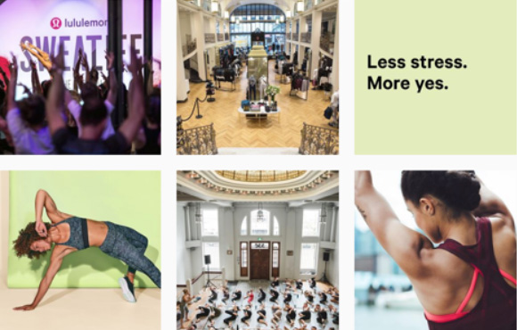
The Yoga apparel brand LuLuLemon is a perfect example of the brand embodiment of a personality type on Instagram. Their constant flow of visual content is one that describes an active yogi lifestyle and embraces positivity. But if you think there’s something more to the magic that makes these photos work, you won’t be wrong.
Visual Stimuli Transition Between Content of Different Perspective
For the most part, a seamless visual experience is nothing more than proper design. Even though social media managers don’t have a canvas to work with, they certainly show an eye for consistency. Happening naturally with a dash of talent, the visual flow of the content can easily be analyzed for its beauty to be seen.
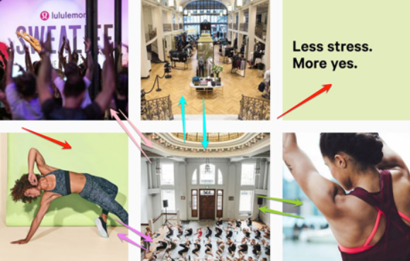
Following the above example, you can see that in six random successive photos, the manager of the Lululemon Instagram account has definitely expressed some creativity. In fact, while of different style and perspective, the photos manage to share much of the same qualities between them.
For example, the bottom left photo has the same color palette as the one found on the top right. Not to mention, the top left and the bottom center photos both depict groups, even if performing different activities.
The more you look into it, the more you will see the slight intricacies that connect the seemingly different photos in a neat visual manner. Of course, Lululemon is not the only ones that do that.
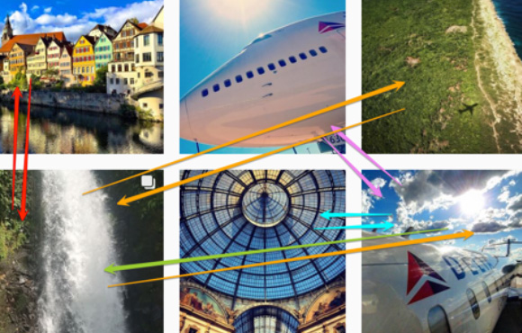
By checking the Instagram profile of Delta Air Lines and choosing six consecutive random photos, you’d be able to see a similar picture. While of completely different perspective and depicting both picturesque nature and airplanes, the content just fits together.
The photos complement each other in various ways. For example, note how the dome in the bottom center photo is the same as the color palette as the sky in the bottom right photo. On the surface, the similarities might seem random or obvious, but the fact of the matter is that achieving such visual consistency does require a dose of talent.
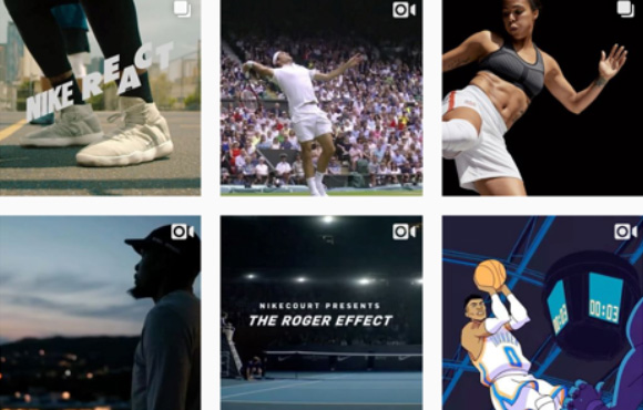
Nike is another great example of visual flow consistency achieved through hue and color palette patterns. Their photos and videos all incorporate the same flow of the visual content. What’s more, instead of switching back and forth between visual styles, the sports brand manages to naturally transition from style to style within a few posts.
Can you spot the color palette and visual stimuli consistency found within the latest content posted on Nike’s Instagram? They even make a cartoon work.
Overall Consistency of the Visual Flow
Much like the sensation and perception complement each other, the colors we see through the visual sensations of different photos are better experienced through our perception when they complement each other. This statement is as true for a masterpiece in an art museum, as it is for a great website design and a visual flow within the content of an Instagram post.
For the most part, due to the complicated nature of photos and videos, we probably won’t see Instagram visual consistency classes being taught in universities in the near future. But what stands true for color and hue palettes and patterns in related fields, is also true on Instagram.
In the fast-paced data-driven marketing world of today, it is often easy to forget that we are, but humans. And while you should always take into account the mechanical, you should also consider the creative.
When scrolling down an Instagram account with a huge following, you’d be able to easily see a visual flow pattern. Yet, without thinking about the aforementioned similarities in the visual stimuli and style that make it possible, you might not be able to appreciate it as much.
To best take advantage of your own perception, make sure to arrange the photos and videos in your planned posting order and go through them one after another. Does a certain content piece stand out? In what way? Also, don’t forget to consider the fact that all visual content should also fit within the definition of your brand personality.
A great way to ensure that you’ve made the right choice is by checking in with a colleague or a friend. For bigger marketing campaigns, performing an audience perception research might be the best choice. However, for most day-to-day content posted on the photo sharing platform, having your content looked at by another set of eyes should be more than enough.
The Hardwired Human Perception and its Effect on Social Media
As proven by numerous scientific studies, the brain is hardwired to seek order in chaos. We try to look for patterns and we consider beauty to be near perfection. Yes, each and every one of us has a certain idea of what looks stunning and what is ugly, but we all share the same visual perception.
Much like with any other visual design niche, Instagram is highly affected by our natural pattern-seeking abilities. There’s a reason why we love when something fits just right. We are hardwired to do so. Hence, seeing a seamless flow of visual content on Instagram instantly being a gratifying experience.
For the most part, when sharing photos on the social media, even the best of managers won’t put that much analysis and thought into the content itself. Yet, their inner desire and talent to make things fit will result in a consistent flow of content that is visually pleasing to the viewer.
With that in mind, next time you post on Instagram, remember that people like to read a story. And a few photos in succession that visually complement each other create such a story. Yes, you might not be able to read it out loud, but our brains perceive it as such. Thus, consider the viewing experience of a person scrolling down your feed next time before you plan out your photos.
And if you are not sure if your new social media strategy works, you can always check your Instagram stats with a 7-day-free trial of Locowise. Sign up today!


